Due to the higher availability of design software it is much easier for businesses and companies to design their logos and marketing images. Because of the importance of a brand, businesses have to ensure that their logos are easy to understand and recognise. The coherence of these logos and brands can depend on the typography chosen.
Why do businesses rebrand?
A bad logo can affect the reputation of some businesses as they slowly start to become outdated and unrecognisable to some of their audience, therefore rebranding could restore a business’s income and popularity. Logos and typography that appears unprofessional and childish can be perceived as unreliable therefore simple typeface choices can have a heavy impact on the number of customers a business receives.
Font Styles
A common way businesses redesign to appear more modern and professional is by deciding to change their typefaces.

The four brands above are perfect examples of this. All the original serif and calligraphy styles have been replaced with san-serif and bold fonts eliciting more authoritative and professional emotions compared to the previous styles. Their colour palettes remained similar however, besides airbnb, so they are still recognisable to their audience and preserve their personality. This strategy is clearly effective as high end brands associated with luxury acted similarly.
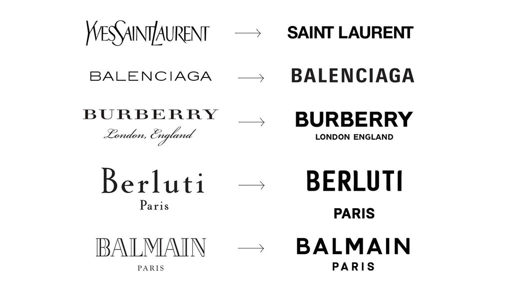
The similarities between these alterations are obvious as the typography has become much sleeker by making the font bold and capitalised, creating an appearance of purpose. With the lettering having the same x-height and being capitalised it is easier to read, in contrast to the original Yves Saint Laurent typography which could be conceived as more childish with its resemblance to handwriting.
Furthermore, Burberry originally used two opposing typography styles for the business name and location underneath, although giving the impression of sophistication with the calligraphy style, the two did not compliment eachother. By using the same font for both it signifies that the elements are as important as each other and that they are coherent.
Colours
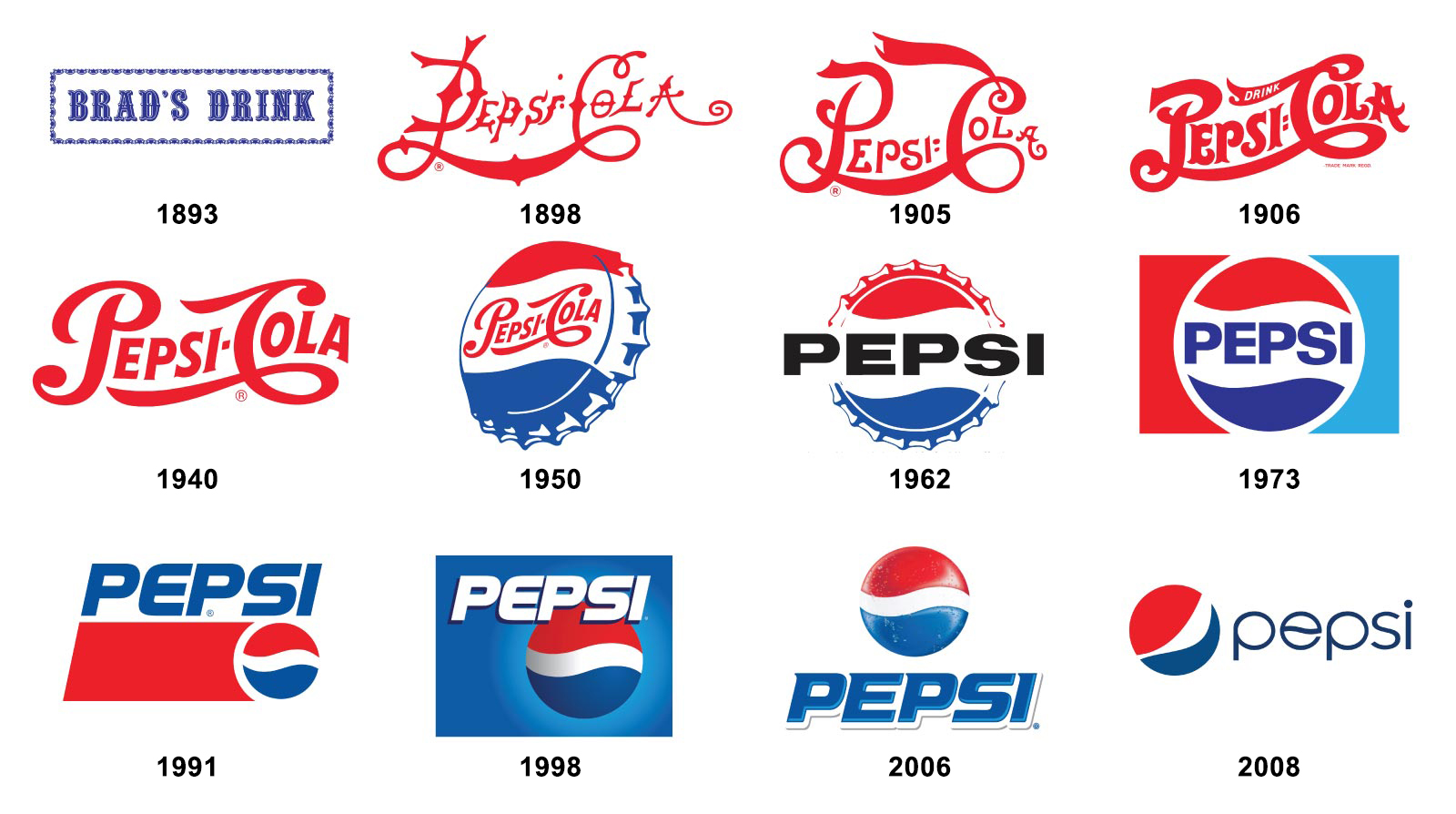
A brand that has been redesigned throughout the years is Pepsi. Although their colour palette has remained the same, consisting of red, white and blue, the colour of the typography has switched between them and the typeface continuously altered. Between 1898 and 1950 the typography was a red, calligraphy style, nevertheless, this design is incredibly similar to Coca-Cola, one of Pepsi’s largest competitors, therefore differentiation was needed for distinctiveness.
From 1950 the blue tones became incorporated into the brand and remains the colour used currently, making it an opposite to Coca-Cola. The blue has calmer connotations, compared to the more aggressive red of Coca-Cola, and matches the blue used in the circular logo, proving to audiences that they are connected. The ‘e’ within the font has been personalised to have a small wave across the middle, as a reference to the previous logos with a wave down the centre of the circle.
In contrast to the matching colours for typography and logo, some businesses have decided to keep their text in black to contrast to their more colourful logos. An example of this is Instagram’s surprising brand redesign in 2016, which transformed its colour palette completely. From its more reserved browns in a 3D camera, a purple to yellow 2D gradient design was used as a replacement.

Although the logo was completely modified, the typography has remained similar; the decorative handwritten style could reference the personalised and creative nature of the platform, and the upload type its users post. The conversion from blue to black typography may have been used to reduce the friction between the logo and text as the logo is incredibly vibrant so the typography balances this out by being black and reserved. The use of black also creates a sense of professionalism within the app as well as creativity, implying its success and popularity.
Results of a Rebrand
The importance of rebranding is vital when audiences are no longer attracted to the logo as the professionalism behind them is the cause of convincing people to use a companies products or services. The typography must balance with the imagery and colours in order to make them coherent and make them feel trustworthy to customers.
